The Psychology of Color in Interior Design: How Colors Affect Mood
Colors paint our emotions on the canvas of home, transforming walls into mood rings that reflect our inner states. From calming blues to energizing reds, interior design becomes a psychology experiment, proving that the right hue can turn any room into a haven for the soul.
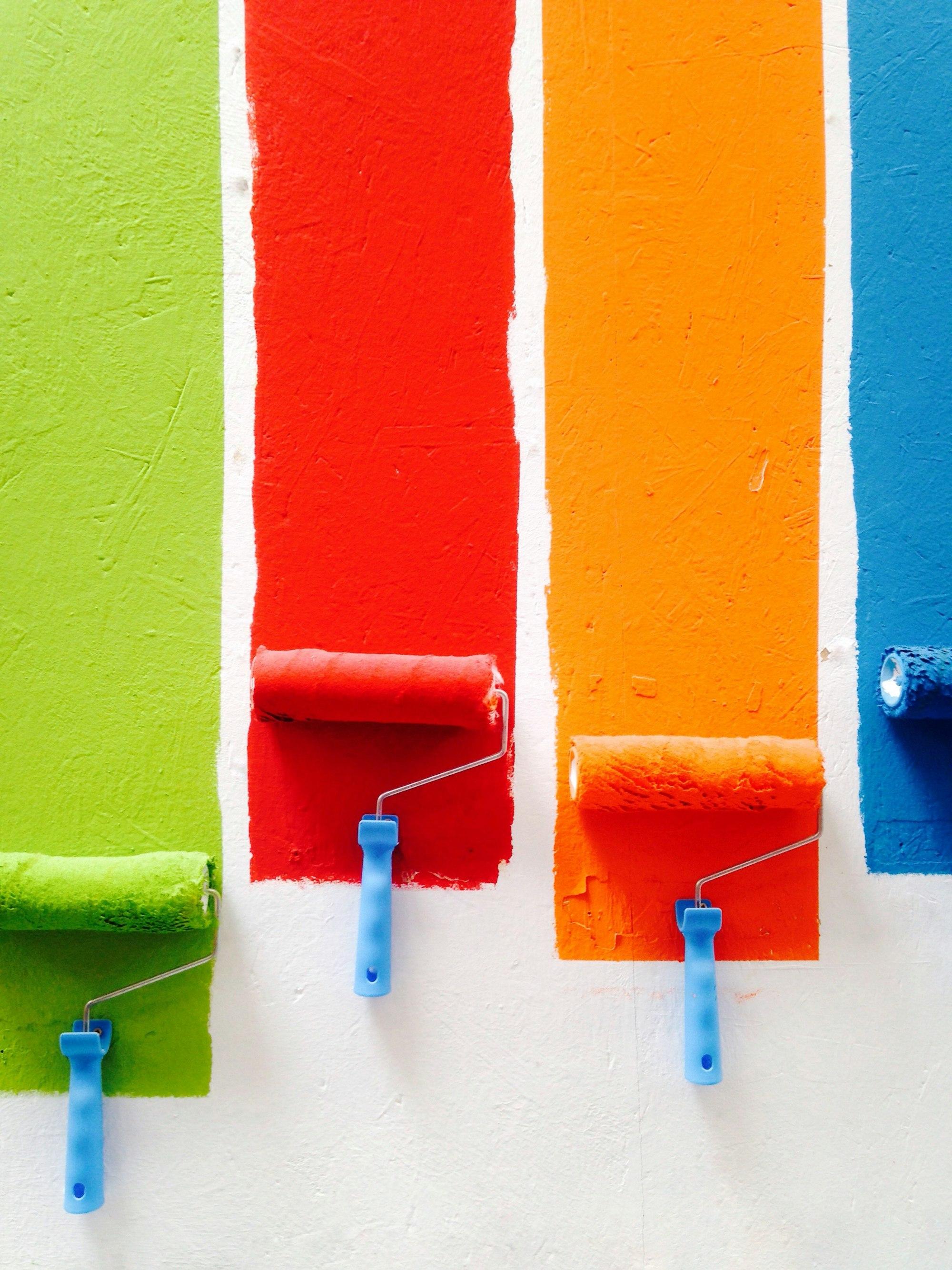
Photo by David Pisnoy
Understanding the impact of color in interior design is essential for creating spaces that resonate with our emotions and enhance our well-being. The colors we choose for our homes can significantly influence our mood, energy levels, and overall atmosphere. This article delves into the psychology of color, exploring how different hues can transform a room and affect our daily lives. By examining the intricate relationship between color and emotion, we can better appreciate how our surroundings shape our experiences and interactions within our homes.
The Basics of Color Psychology
Color psychology is the study of how colors affect human behavior and emotions. Each color evokes specific feelings and associations, making it crucial to consider these elements when designing a space. The psychological effects of color can be both subtle and profound, influencing everything from our productivity levels to our sense of comfort. For instance, research has shown that certain colors can even affect our physiological responses, such as heart rate and blood pressure. This interplay between color and emotion underscores the importance of thoughtful color selection in interior design.
Warm vs. Cool Colors
Colors can be broadly categorized into warm and cool tones. Warm colors, such as reds, oranges, and yellows, tend to create a sense of energy and warmth. They can stimulate conversation and encourage social interaction, making them ideal for living rooms and dining areas. These colors are often associated with feelings of excitement and enthusiasm, which can be particularly beneficial in spaces designed for gatherings and socializing. However, it is essential to balance warm colors with cooler tones to prevent overwhelming the senses and to create a more inviting atmosphere.

On the other hand, cool colors like blues, greens, and purples promote calmness and relaxation. These shades are often used in bedrooms and bathrooms to create a serene environment conducive to rest and rejuvenation. Cool colors can also enhance focus and concentration, making them suitable for workspaces and study areas. The choice between warm and cool colors ultimately depends on the desired mood and function of the space, as well as the personal preferences of the inhabitants.
Color Associations
Different colors carry various cultural and emotional associations. For instance, blue is often linked to tranquility and stability, while yellow is associated with happiness and optimism. Understanding these associations can help you select colors that align with the desired mood of your space. Additionally, colors can have different meanings in various cultures, which is an important consideration for those who wish to create a globally inspired design. For example, in some cultures, red symbolizes good fortune and joy, while in others, it may represent danger or warning. This cultural context can significantly influence how colors are perceived and experienced in a given space.
Moreover, the psychological impact of color can also vary based on individual experiences and personal preferences. A color that evokes positive memories for one person may trigger negative feelings in another. Therefore, it is essential to consider not only the general associations of colors but also the unique emotional responses they may elicit in the individuals who will inhabit the space. This personalized approach to color selection can lead to a more meaningful and harmonious environment.
Choosing the Right Colors for Your Space
When selecting colors for your home, consider the purpose of each room and the emotions you want to evoke. Here are some tips to guide your choices:
- Assess the Room's Function: Think about how you use the space. A home office may benefit from energizing colors, while a bedroom should lean towards calming hues. Additionally, consider the activities that will take place in each room. For example, a playroom for children might benefit from bright, cheerful colors that stimulate creativity and playfulness.
- Consider Natural Light: The amount of natural light a room receives can alter how colors appear. Test paint samples in different lighting conditions to see how they change throughout the day. Natural light can enhance the vibrancy of colors, while artificial lighting can create different moods and alter perceptions of color. Therefore, it is crucial to evaluate how light interacts with your chosen colors at various times of the day.
- Use Color Theory: Familiarize yourself with the color wheel. Complementary colors can create vibrant contrasts, while analogous colors can provide a more harmonious look. Understanding the relationships between colors can help you create a balanced and visually appealing design. Additionally, consider the psychological effects of color combinations, as certain pairings can evoke specific emotions and responses.
Popular Colors and Their Effects
Here’s a closer look at some popular colors and the moods they can evoke:
Red
Red is a powerful color that can evoke strong emotions. It is often associated with passion, excitement, and energy. However, too much red can lead to feelings of aggression or anxiety. Use it as an accent color to create a focal point without overwhelming the space. For instance, a red accent wall can serve as a striking backdrop for artwork or furniture, while red accessories like cushions or vases can add pops of color without dominating the room. Additionally, red can stimulate appetite, making it a popular choice for dining areas and kitchens.

Blue
Blue is known for its calming effects. It can help reduce stress and promote a sense of peace. Lighter shades of blue are particularly effective in creating a tranquil atmosphere, making them ideal for bedrooms and bathrooms. Darker shades of blue can add sophistication and depth to a space, making them suitable for home offices or libraries. Furthermore, blue is often associated with productivity and focus, making it an excellent choice for workspaces. Incorporating blue through paint, textiles, or decor can create a serene and inviting environment that encourages relaxation and concentration.
Green
Green symbolizes nature and renewal. It is refreshing and can help create a balanced environment. Incorporating green into your design can promote feelings of harmony and well-being, making it suitable for almost any room. From soft sage to vibrant emerald, green offers a wide range of shades that can evoke different emotions. For instance, lighter greens can create a sense of tranquility, while deeper greens can add richness and sophistication. Additionally, incorporating plants and natural elements into your design can enhance the calming effects of green, bringing the outdoors inside and fostering a connection with nature.

Yellow
Yellow is often associated with happiness and positivity. It can brighten up a space and stimulate creativity. However, too much yellow can be overwhelming, so it’s best used in moderation or as an accent color. Consider using yellow in small doses, such as in artwork, throw pillows, or decorative accessories, to add warmth and cheerfulness to a room. Additionally, pairing yellow with complementary colors, such as gray or navy, can create a balanced and sophisticated look. Yellow can also be particularly effective in spaces where you want to encourage social interaction, such as kitchens and dining areas.
Creating a Cohesive Color Palette
Once you have a sense of the colors you want to incorporate, it’s essential to create a cohesive color palette that flows throughout your home. Here are some strategies to achieve this:
- Choose a Base Color: Start with a neutral base color for your walls and larger furniture pieces. This will provide a versatile backdrop for your accent colors. Neutrals like beige, gray, or white can create a calming foundation that allows other colors to shine without competing for attention.
- Incorporate Accent Colors: Select two to three accent colors that complement your base color. Use these in smaller decor items, artwork, and textiles to add interest without overwhelming the space. Consider the emotional impact of your chosen accent colors and how they interact with your base color to create a harmonious atmosphere.
- Consider Texture: Different textures can enhance the visual appeal of your color palette. Incorporate various materials like wood, metal, and fabric to create depth and dimension. Textures can also influence the perception of color, as shiny surfaces may reflect light differently than matte finishes. This interplay between color and texture can add richness and complexity to your design.
Color Trends in Interior Design
As with any aspect of design, color trends evolve over time, influenced by cultural shifts, technological advancements, and changing consumer preferences. Staying informed about current color trends can help you make informed decisions when selecting colors for your home. For instance, earthy tones and natural hues have gained popularity in recent years, reflecting a growing desire for sustainability and a connection to nature. These colors can create a warm and inviting atmosphere, making them ideal for creating a cozy home environment.

Additionally, bold and vibrant colors are making a comeback, as homeowners seek to express their individuality and creativity through their spaces. Accent walls, colorful furniture, and statement decor pieces can all contribute to a lively and dynamic interior. However, it is essential to balance bold colors with neutrals to prevent overwhelming the space and to create a sense of harmony.
Final Thoughts
Color plays a vital role in interior design, influencing our emotions and the overall ambiance of our spaces. By understanding the psychology of color and thoughtfully selecting hues that align with your desired mood, you can create a home that not only looks beautiful but also feels inviting and harmonious. The interplay between color, light, and texture can transform a space, making it a true reflection of your personality and lifestyle.
As you embark on your design journey, remember that the colors you choose should reflect your personal style and enhance your quality of life. With careful consideration and a bit of creativity, you can transform your home into a sanctuary that nurtures your spirit. Embrace the power of color and let it guide you in creating spaces that inspire, comfort, and rejuvenate you and your loved ones.
Quick facts
How do colors impact your mood?
Colors can evoke different emotional responses depending on their hue, saturation, and brightness. Warm colors like red and yellow are associated with energy and excitement, while cool colors like blue and green promote calmness and relaxation. The psychology of color explores how these effects can influence our feelings and behaviors in interior design.
What emotion does each color represent?
Each color tends to evoke specific emotions. For example, red is associated with passion and energy, blue with calmness and stability, yellow with happiness and optimism, and green with nature and tranquility. These associations can be utilized in interior design to create specific atmospheres in rooms.
What are the four psychological colors?
The four psychological colors typically referenced are red, blue, yellow, and green. These colors are thought to have the most direct impact on human emotions. Red stimulates energy and passion, blue induces calm and trust, yellow evokes happiness and optimism, and green is associated with balance and harmony.
How to test if color affects mood?
You can test how colors affect your mood by observing your reactions to different environments. Spend time in rooms painted in various colors or change the lighting to different hues. Pay attention to how you feel in each setting—are you more energized, calm, or anxious? This will help identify how colors impact your mood.

Mihai Crisan
Software Engineer at Spoken
Mihai is a dedicated software engineer at Spoken, where he combines his passion for technology with his professional expertise. As a tech geek, he is always on the lookout for innovative solutions to simplify and enhance people's lives through cutting-edge technology. Mihai’s curiosity drives him to explore and implement new ideas that make a real impact.
Read more