11 Design Principles of Beautiful Homes
Unlock the magic of beautiful homes: Embrace natural light, ensure smooth flow, declutter, create focal points, balance visuals, play with symmetry, use lines and color harmoniously, add texture, layer lighting, and personalize your space for a design that reflects you.

Some principles in interior design are timeless and accessible.
Beautiful spaces cast spells. Arriving feels like walking through a portal to a new and distinct world. Each time I enter this kind of mesmerizing space, I am left wondering: how did the space designer achieve this?
Last year, we fell in love with The Interior Design Handbook by Frida Ramnstedt for its clear and simple explanations of important principles in interior design.
Making a home is hard enough, and discovering your preferences is a lifelong journey. Yet the principles of beautiful interior design are timeless and somewhat straightforward.
We’ll decode some the magic of beautiful spaces by exploring key concepts and offer practical advice on implementing them in your own home in a way that reflects you.
1. Embrace Your Home’s Natural Light
Natural light is one of the home’s precious resources. Sunlight shapes mood, enriches colors, and even improves our health.
Each room in your home will have its own natural light profile, dictated by where you are on earth, the orientation and size of windows, and any environmental obstacles to light.
Rooms with south-facing windows receive the most daylight. You can experiment with both warm and cool color tones. Mirrors are magic for bouncing light around. Glossy finishes or metallic elements can amplify this effect, making the space feel larger and more luminous.
Rooms with north-facing windows get more diffuse light. These rooms can hold more reflective space. You can use artificial light or reflective colors to brighten the space. Varied light sources and layered lighting can enhance a room's depth and dimension, making it warm and inviting.
Meanwhile, East and West orientations play with the sun in unique ways, offering dramatic sunrise and sunset light. You may want to consider window treatments and landscaping to balance light and temperature throughout the day.
2. Design Your Home for Flow
Smooth movement around the house is key to a well-designed home. It's about creating an intuitive path that connects spaces seamlessly. It's the dance floor of your home's layout.
Think about how you move through your home and arrange furniture to support that journey. Flow is influenced by the arrangement of furniture, the layout of rooms, and even door placements. Keep main pathways clear. Aim for at least 36 inches of walking space in high-traffic areas. Incorporating transitional elements like rugs or lighting can subtly guide movement and enhance the sense of flow.
Also, consider the visual flow by aligning furniture and decor in a way that draws the eye through the space, enhancing both physical and visual movement. Strategic use of color and texture can also play a significant role in guiding the eye and feet through your space.
3. Prioritize Storage to Declutter Spaces
A cluttered home is a stressed home. Efficient storage declutters and harmonizes your home, turning chaos into tranquility.
The 20/80 storage rule – 20% storage to 80% free space – ensures a functional yet open environment. Embrace built-in storage and multi-functional furniture to maximize space. Think wall units, under-bed storage, and multi-functional furniture.
Always declutter before you start organizing. It’s hard. Take photos of meaningful items. Then, embrace the art of letting go.
4. Create Clear Focal Points
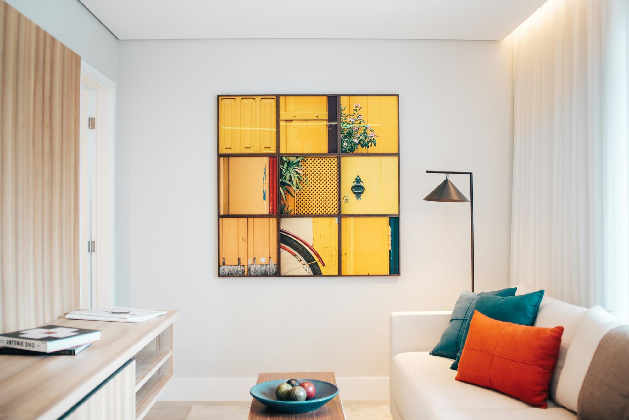
Focal points anchor your space, providing a visual hierarchy that guides the eye and adds interest. A focal point can be anything from a fireplace, a stunning piece of art, or a feature wall – and acts as the star of the room that everything else supports.
Give your focal point breathing room to stand out. Avoid cluttering it. Balance the rest of the room by using smaller, supporting elements that complement, not compete.
5. Establish Balance with Visual Weight
Visual weight refers to the perceived heaviness of an object or element within a space, influenced by its size, color, and texture. Darker hues, larger sizes, and more complex textures appear heavier, whereas lighter hues, smaller sizes, and simpler textures appear lighter.
Attention to visual weight helps create balance and harmony. Artful placement of elements can make a room feel anchored and cohesive. Play with symmetry or asymmetry (below). There are no right answers. Experiment until it "feels right."
6. Choose Symmetry or Asymmetry
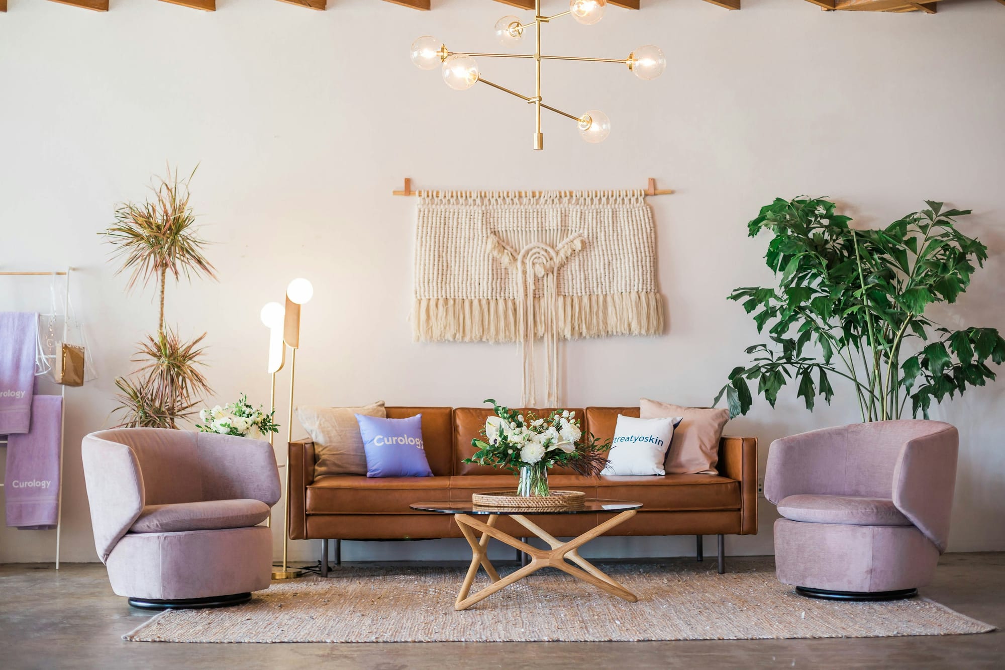
Symmetry is a design principle that mirrors elements on either side of a central point, creating a sense of calm and stability. This arrangement is easy for the brain to process, making spaces feel well-organized and serene.
For symmetry, you can start simple. Pair matching lamps on either side of your sofa or align artwork with furniture pieces. Though symmetry doesn't have to be boring—play with textures and shades for depth. The bedroom is a great candidate for symmetry.
Asymmetrical designs focus on balancing different objects that have similar visual weights but are not identical. It offers the freedom to express creativity and inject personality into your space.
For example, you might balance a tall floor lamp with a cluster of plants and a side table to achieve an engaging, asymmetrical look. This approach encourages eye movement, adds dynamism, and provides layout flexibility – perfect for informal, lived-in spaces.
7. Make Use of How Your Mind Perceive Lines
Lines shape our perception of space. They guide the eye and influence the room's overall feeling. Horizontal lines create a sense of stability, vertical lines convey height and formality, and dynamic lines add energy and movement.
Use horizontal lines in furniture to extend spaces. Vertical lines, like tall bookcases, can make ceilings feel higher. Mix in some dynamic lines with accessories for zest.
8. Orchestrate Your Color Harmony
Color has its own psychology. It can energize, soothe, and inspire. You are seeking a palette that compliments your space and lighting and reflects your personal style. To find harmony, consider adopting the 60/30/10 rule.
This principle suggests that 60% of your room should feature a primary color, setting the overall tone and unifying theme. This dominant hue typically covers the walls or large areas like rugs or a sectional sofa, laying the foundation for your color scheme.
Next, allocate 30% of the room's color to a secondary hue. This color supports the primary, adding depth and interest. It's often introduced through upholstery, curtains, or an accent wall, providing a middle ground that bridges the dominant color and your accent choices.
The remaining 10% is where your creativity shines through with an accent color. This is your opportunity to inject personality and flair into the space. Accent colors come to life in smaller accessories, throw pillows, or artwork, offering pops of color that make the room pop and bring your design vision to full fruition.
9. Add Personality with Texture and Patterns
Texture refers to the surface quality, while pattern relates to repetitive design. Texture and pattern both add depth and interest, preventing spaces from feeling flat or monotonous. They can also add visual weight and dimension. They invite the eye to explore.
You can match textures and patterns. For example, a chunky knit throw, a smooth leather ottoman, and a patterned rug can coexist beautifully when balanced.

10. Layer Light Intentionally
Natural or not, proper lighting transforms the ambiance of a room, making it warm and welcoming or cool and invigorating.
There are three main types of lighting: ambient (or general lighting), task lighting, and accent lighting. Ambient lighting provides overall illumination, task lighting focuses light on specific areas for work or reading, and accent lighting highlights architectural features or artwork.
Layer your lighting to create depth and interest. Start with a base of ambient lighting, then add task lighting in areas where you work or read. Finally, use accent lighting to showcase art, plants, or unique architectural elements.
Dimmer switches are a great way to adjust the mood and intensity of your lighting, allowing for flexibility depending on the time of day or the atmosphere you wish to create.
11. Personalize Your Spaces
Your home is a reflection of you. Incorporate elements that have personal meaning or evoke memories. You can tell your story through design choices, from artwork to heirlooms.
Create a gallery wall of your favorite prints or family photos. Display collections, whether it's vintage cameras or ceramic vases, in a way that highlights their importance to you. Choose decor pieces that speak to your interests and passions.
Ultimately, any and all of the aforementioned ideas – from color to asymmetry – are an opportunity to find a design that resonates with you.
Above All, Your Most Beautiful Home is Yours
You needn’t be overwhelmed by trying to incorporate all of these principles. Rather, pick a few that appeal to you to focus on. You might be drawn more to the color rule or fascinated by asymmetry. Follow your heart.
Designing a beautiful home is a journey of understanding these principles and applying them in a way that reflects your unique style. The goal is to create a space that feels right to you—one that's a reflection of your personality, your needs, and your dreams. The most beautifully designed spaces are those that feel like home.

Geoff Abraham
Co-founder & President of Spoken
Geoff is the co-founder and President of Spoken. He is a Dad. He holds a BA from UT Austin (Plan II) and an MBA from Stanford. Geoff has built several successful businesses, including a bicycle taxi business in San Francisco which he ran for 10 years with his wife, Mimosa. He is an executive coach, and he actively invests in seed-stage startups via The Explorer Fund.
Read more

